Saturday, December 6, 2008

Dear Richard, it's on.

I have been doing some research on Richard Avedon's work. It is obviously a different approach to the subject compared to others of his time (much colder and well a little predatory compared to the sympathetic one of say Irving Penn). But is it just about throwing in a perfectly white background (and having your subject stand up for an hour?) Not really, as his subjects are actually fairly low contrast (with the exception of the signature slightly overblown skin). I suspect burning and dodging only played a secondary role, and the "signature look" was actually a very distinctive light histogram distribution (in PS lingo) , that back in the day was achieved by using specific developing techniques. So I am doing some research....
This is a good way to (self) describe his work:
"I've worked out of a series of no's. No to exquisite light, no to apparent compositions, no to the seduction of poses or narrative. And all these no's force me to the "yes." I have a white background. I have the person I'm interested in and the thing that happens between us. "

This paragraph was taken from a comment by Jay Johnson on a photo forum.

Back in the 60's, 70's and 80's that NYC fashion guys were big into what everyone is calling the "Avedon look" including Avedon.

Most popular was shooting Tri-X overexposed (pushed to 1200 or more) with a #25 red filter. The models were made up with black lipstick and black nail polish. The film was processed in Dektol 1:3 or 1:4 at 70F for 4-5 minutes after a pre-soak.

This technique results in a porcelain looking skin and a soft but high contrast look that glows."

Will give it a try.

Sunday, November 2, 2008

With a Little Help from my Friends.


This is a simple attempt at balancing
day light with a Q Flash and a softbox. I tried to be subtle, but the effect is quite evident. The flash was 1.5 yards from the model (hey Laurie!) at camera left pointed a bit down. Shot at 32mm 1/100th f 4.0 ISO 100. Flash power down to 1/8. Note to self: use longer focal length for better blurring of background+make flash less evident.

Monday, October 20, 2008

Joe Six Pack


How appropriate. This is a simple product shot done with a digital SLR. The camera is at 45deg.
3 strobes. two softboxes left and camera right with edges close to lens. One gridded flood pointing to the white background under the table level. First set with the Sekonic L-758dr light meter, and the 24-70 f2.8 Canon lens. I know, I upgraded.

Incident dome metering pointing at camera on the near corner of the box. Shutter speed 125th.

-1 all lights: f5.6 Each soft strobe: f4.0. Background f1.2 Shot at f4.5
-2 all lights : f16 Each soft strobe: f11. Background 2. Shot at f14.5

The background measure just shows that there is little spill to the front of the beer pack. The intensity at the background remains the same, it meters f32.5 for the second configuration , 1.5 stops above the midgray at the pack.

Note: the smaller aperture shot is colder by 300k. I corrected with Lightroom.

The whole exercise is about learning to control the depth of field and using minimal postproduction re adjusting. The fun part will be to compare with a 4x5 shot with tungsten lights that I have lined up. Stay Tuned....

Saturday, September 13, 2008

The Dark Smurf


This is a good example of object photography that mimics the set up in a larger space.

Just over and left of the little Smurf is a simple 3 joints table lamp with a metal conic shade and a 60w light bulb. The lamp is so close that it acts as a big softbox for the metal mug on which the Dark Smurf is perched upon. The light is angled down so that the background (just a foot behind) does not receive direct light. Result: a nice light gradient. The bottom is a white table which helps diffusing light. Camera (an old Sony DSC-W3C) settings: ISO 160 f3.2 1/100th EV -1. The mug and the handle were de-focused with Gaussian Blur. I dodged the Smurf and the immediate background just a little bit.

Got the Smurf on a trip to Friburg, Germany. I was six.

Tuesday, June 17, 2008

One more Retro Portrait


This is composition 24 from
"Lighting for portraiture" a great book from Walter Nurnberg
The light scheme is shown here (the softbox on the left was not on), with my favorite take on the left.
The interesting deviation from the "by the book approach" is the light on the right arm and hand. It came from a window I forgot to completely obscure. Compare with the right take.

Photoshop tricks:
- Temp: K5650
- colors substantially unsaturated
- increased contrast on jacket and shirt.
- some minor skin retouching.

Things to improve:


- Not happy with the double highlights in the model's eyes.
- The background light in the right take is a little too distracting.
- Added Oct 08. Contrast between key and fill a tad too low.

Thursday, June 5, 2008

Background Test for Apnea style photo.


She is the lovely Apnea. The photo was taken by the awesome Lithium Picnic. I am not sure about the subject on the right, but that is beside the point. The lighting is subtle, if simple, so how did he do it? My light set up is above...it is a quick first attempt. The interesting bits are the background color gradient and where the lights were. I suspect a bit of photoshopping to brighten up the subject. There is definitely a large softbox as fill (it shines on the rubber at camera left). The light set up I used is below. ISO 100 f9.0 1/160 18mm. Subject at 2ft from background 800ws Octabox and Softbox at 1/32. Diffused 400ws strobe at 1/8th. Lights 6ft high. (the diffused strobe might not be necessary..).

The color gradient was achieved with two layers and the "curves" command. The reddish one was erased on the right. I roughly matched the background colors from the original. The man skin is obviously darker than hers. Things that did not work out: there are two shadows on the right! and not enough detail in the darks. (note: her right background reads 82 87 90). What to do?

  1. Move octabox to center and closer to subject. Add a tad more fill, but not on background.
  2. Lower both softboxes one foot.
  3. Move strobe a little further away?
  4. Right softbox at same distance as subject.
  5. subject a bit further from background.


Monday, March 31, 2008

High Key and Others.


Sunday I explored a range of styles, with some loose inspiration from W magazine and Christine Kessler work: bold colors and accessories, strong lights, often with a simple silver umbrella+flash as the main source and backgrounds with saturated colors.

1-First try in the "Green Room". ISO 200, f 4.5, 22mm 1/160th. In Lightroom: +Vibrance and Green Saturation. Less global Saturation. Darks -30. Yeah Punchy. A bit of Liquify to make the coat fit better. The light scheme is here.


2-The Couch. (Note: people seem to like this one) The trick here is to keep the couch a few feet away from the red wall. No Shadows! Two softboxes (see scheme) and the umbrella in the back as extra fill. ISO 100, 27mm, f9, 1/160th.


The vignetting was added in post production.


3-High Key. This was shot in a corridor overlooking the studio. The big flashes where all at max power in the room behind the model. I used the Vivitar+silver Umbrella as fill at 1/16th and several feet away, with a blue filter to make the scene a bit colder, as the reflections from the studio wall + sunlight (see below) where yellowish. I do not think the filter mattered much in post production. Iso400 (that was silly) 27mm, f5.0, 1/160th. With these settings there was additional sun light from the outside. Model: Angela A.


Thursday, January 31, 2008

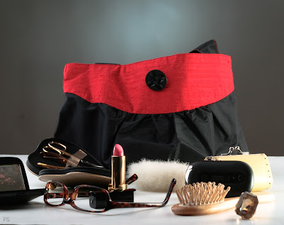
Bag it Up.


My first foray in object photography. This is a line of bags with a vintage look. So I decided they should not look too blingy, but rather have a bit of an understated tone.

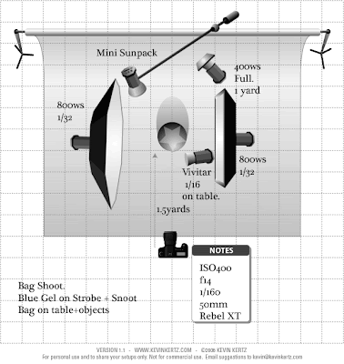
The setup is here on the left. It is a bit complicated, but not really. A snooted strobe with a blue gel to give the "halo"
on the background. Two softboxes to give uniform light and two small strobes (the one on the left with gobos, the one on the right with a mini diffuser) to add a bit of edge and sparkle to the objects.

Tuesday, January 8, 2008

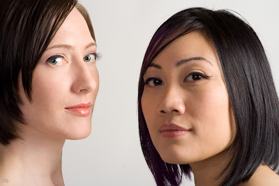
Skin Retouching


I am following this very detailed walkthrough .

This a nice shot of Justice and Robin (make up Kristin Von Claret) after some basic skin retouching with the healing tool and the procedure described in the above link.

Obscure notes to self: if I had to burn or dodge some specific areas:
- layer
- create a new layer
- overlay
-fill with 50% gray

When it is time to create the skin mask for the filters involved in the skin retouching (Lens Blur and High pass) go to the Channels Palette. Make an Alpha Channel and erase/burn as desired. Then turn your newly remodeled Alpha Channel/Mask into a selection: Go back to the Layers Palette and, making sure your layer (I use the top layer that contains all the sublayers) is the Active Layer, click on the third-from-the-right-button on the bottom of the Layers Palette which will turn your still-selected new Alpha Channel into that Layer's new Layer Mask. (this last detail is not in the skin retouching howto).